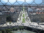
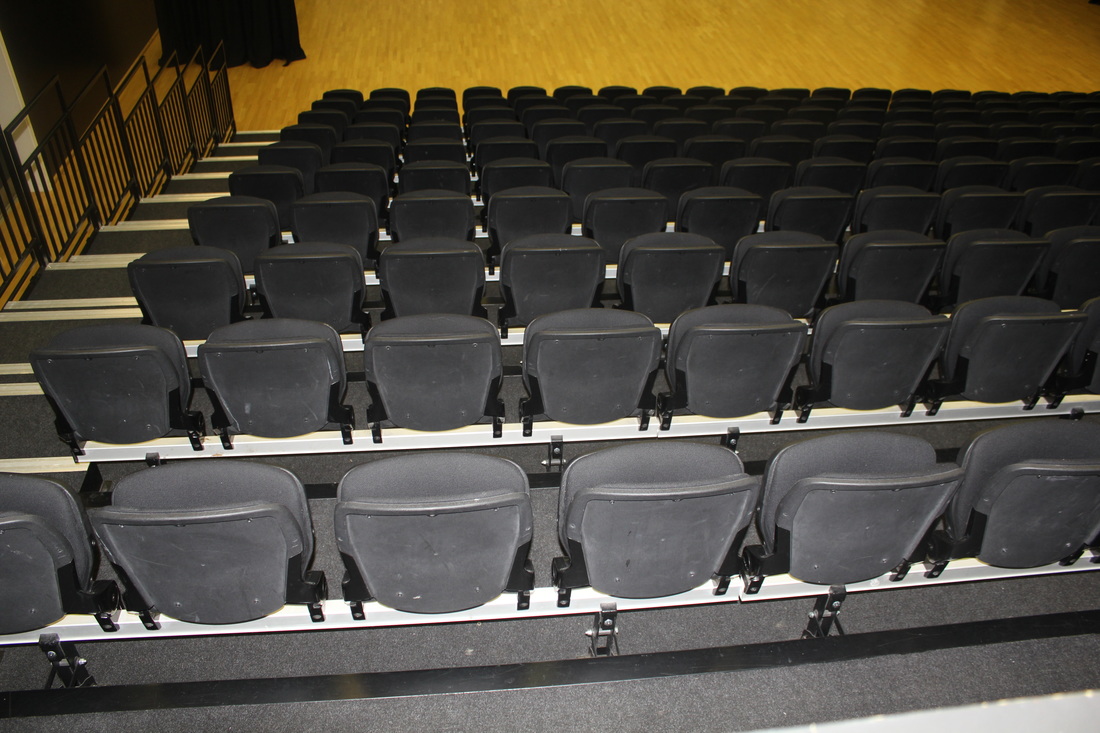
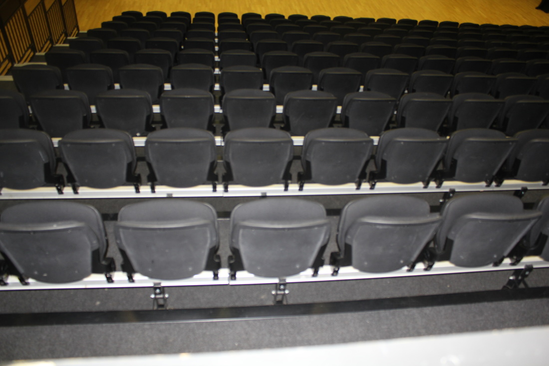
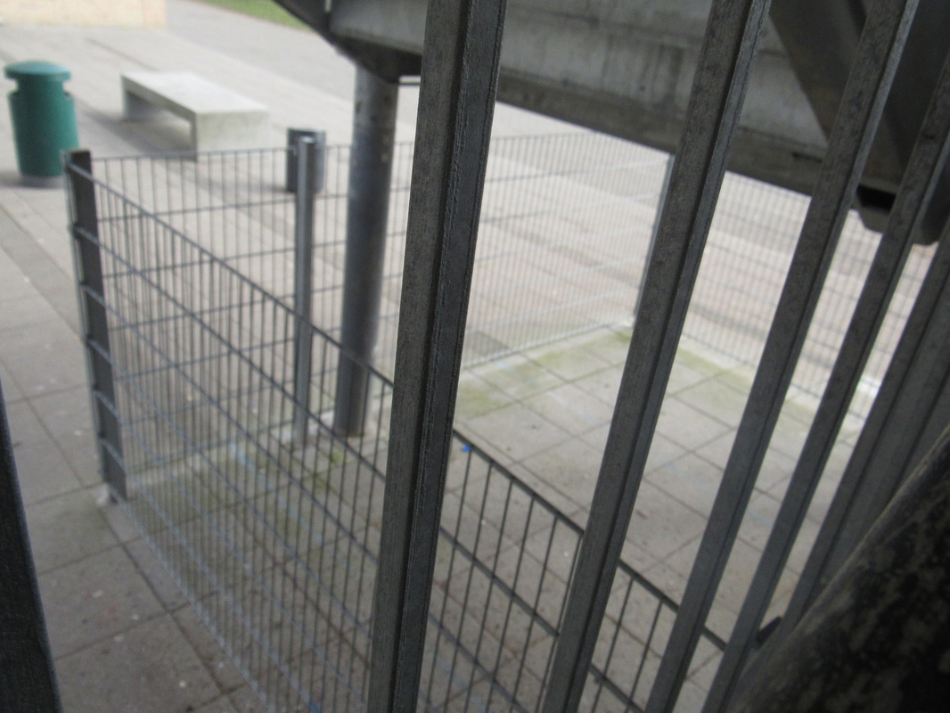
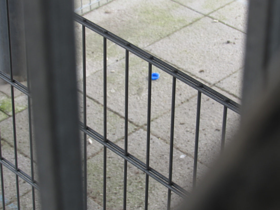
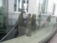
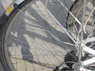
This is abstract because at the front of the photo the fence is a diamond shape which makes the photo have a nice pattern in the foreground. Also the background is focused and the fence is not.
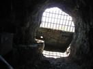
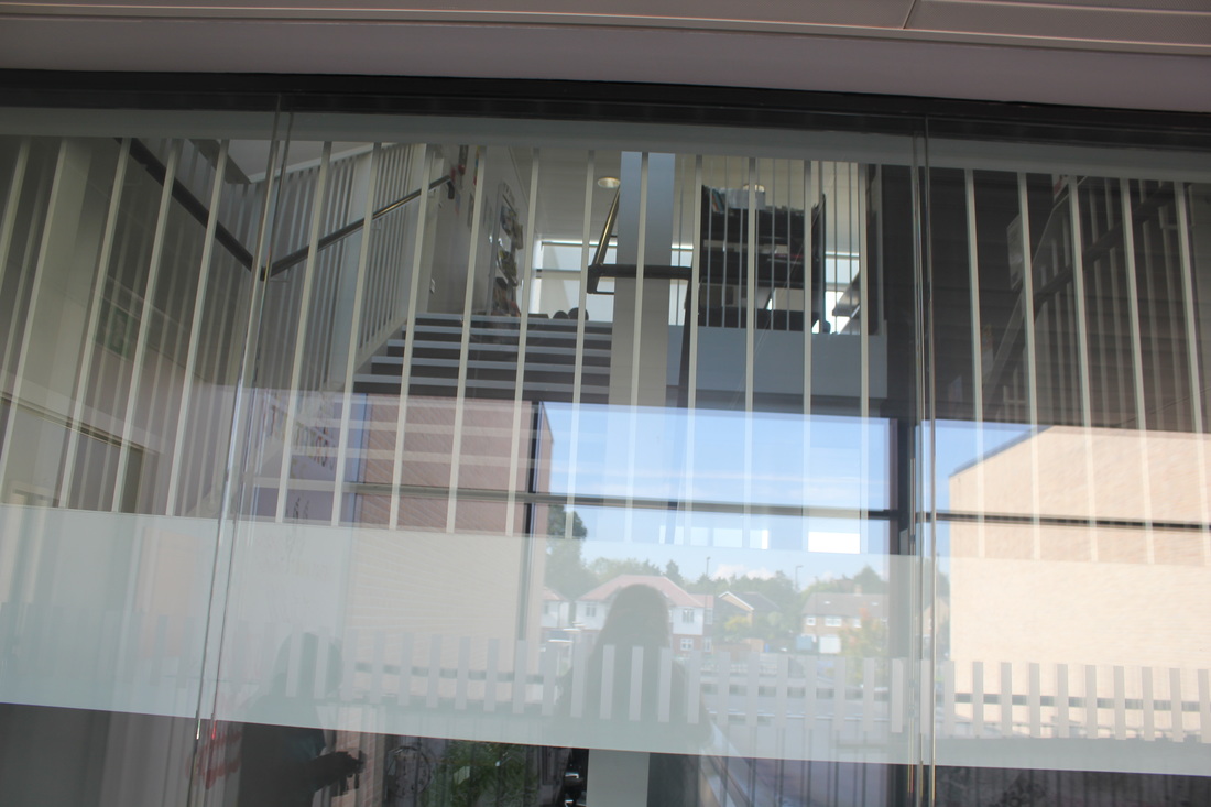
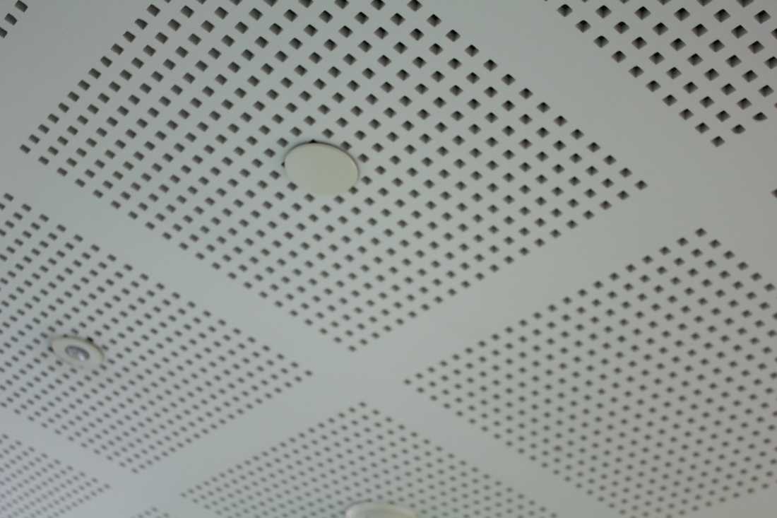
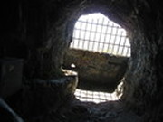
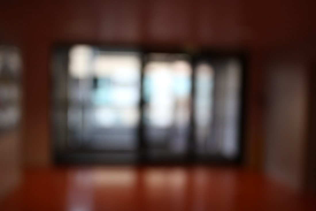
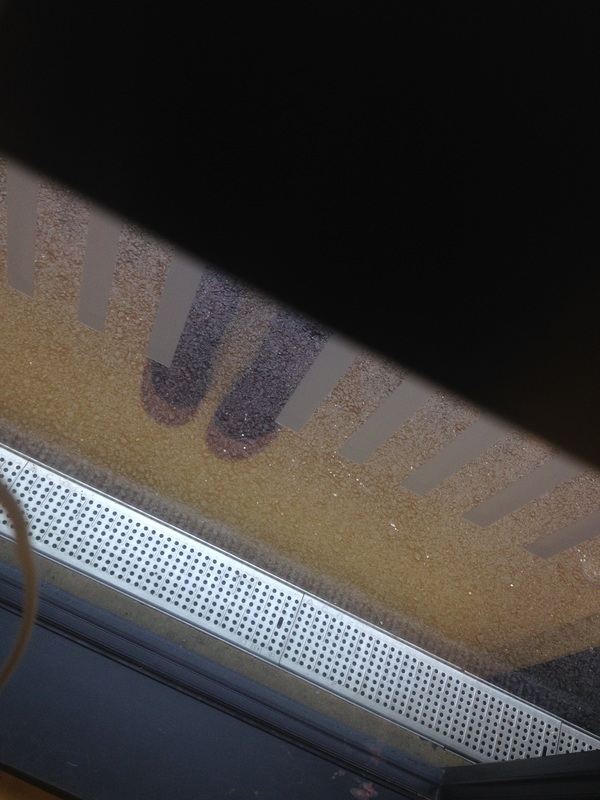
I think this could be abstract because the light goes through this kind of grid window which leaves a shadow of the grid pattern on the floor of the cave which makes it look abstract.
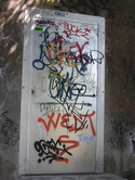
This photo I have taken, it was in a mountain and there was a random white door that had loads of different coloured graffiti. Because of the texture of the writing and the different amount of colour on the white background I thought it looked quite abstract.
|
|
I was not to sure if this would be an abstract photo but I think it could be so I put it up.
The reason I think this is because
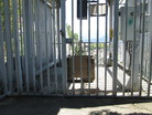
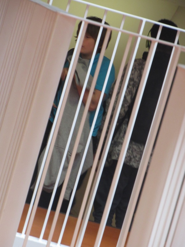
there was a cage that just had loads of lines and there was a box in the middle, also the box was square and so was the cage.
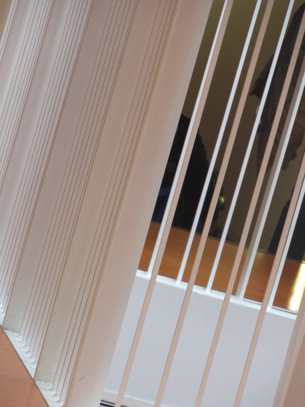
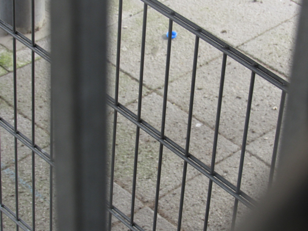
I think this is an abstract photo because its the same as the first one but this time the background isn't focused and the foreground/ fence is focused. The fence makes the view look more interesting.
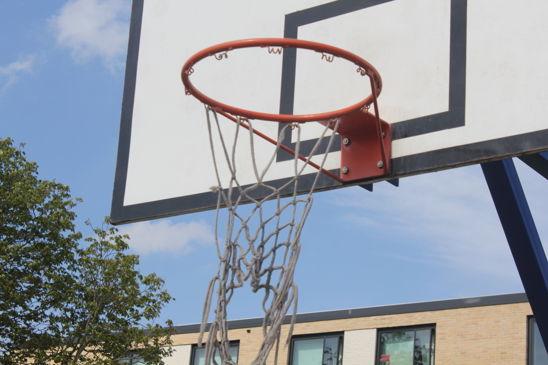
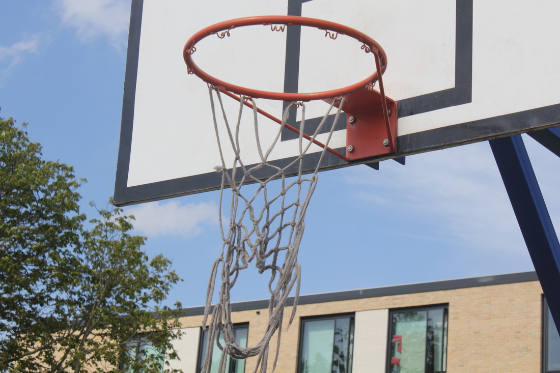
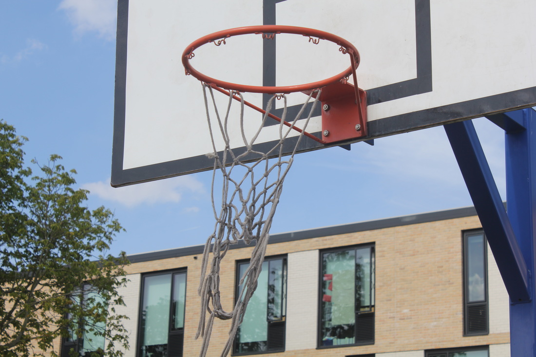
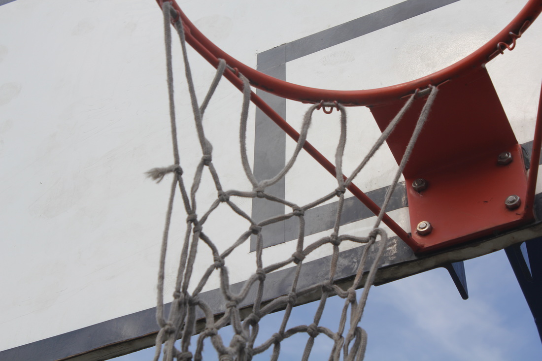
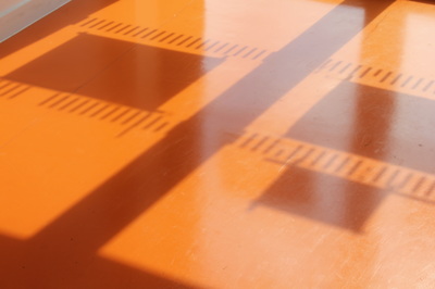
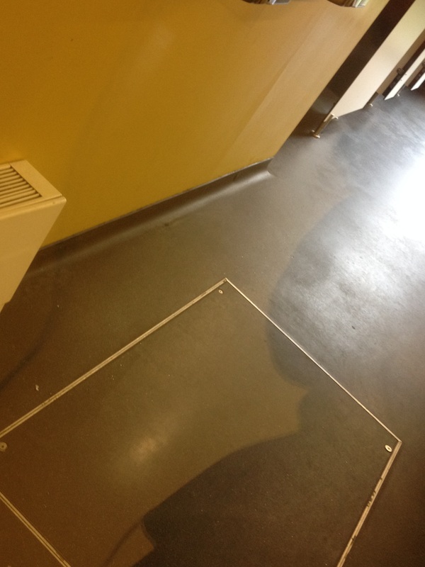
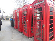
I think this is very abstract because there are two boxes, both have two different colours (red&blue) and also there is a pattern on both of the boxes which is a diamond shape.
the formal elements
|
Focus:
Light: Line: Repetition: Shape: Space: Texture: Value/Tone: |
Which areas appear clearest or sharpest in the photograph? Which do not?
Which areas of the photograph are brightest? Are there any shadows? Does the photograph allow you to guess the time of day? Is the light natural or artificial? Harsh or soft? Reflected or direct? Are there objects in the photograph that act as lines? Are they straight, curvy, thin, thick? Do the lines create direction in the photograph? Do they outline? Do the lines show movement or energy? Are there any objects, shapes or lines which repeat and create a pattern? Do you see geometric (straight edged) or organic (curvy) shapes? Which are they? Is there depth to the photograph or does it seem shallow? What creates this appearance? Are there important negative (empty) spaces in addition to positive (solid) spaces? Is there depth created by spatial illusions i.e. perspective? If you could touch the surface of the photograph how would it feel? How do the objects in the picture look like they would feel? Is there a range of tones from dark to light? Where is the darkest value? Where is the lightest? |
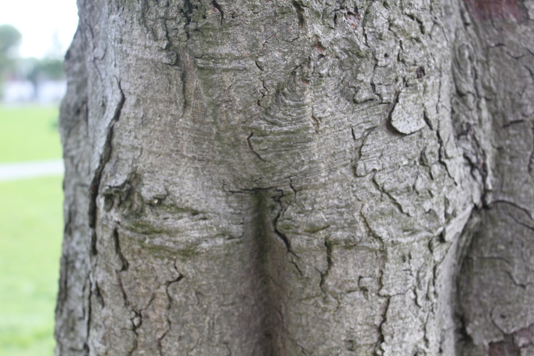
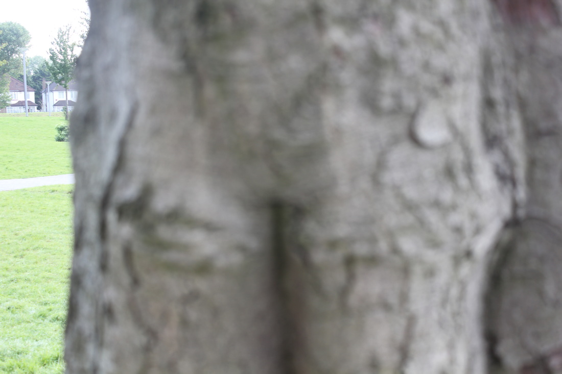


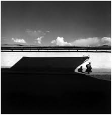
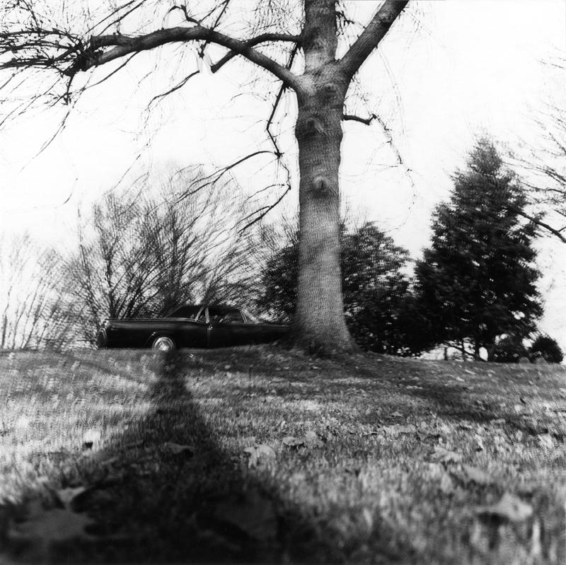
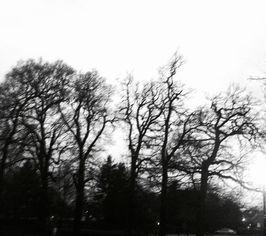
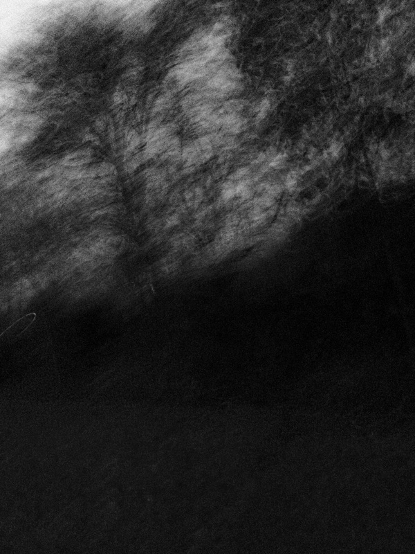
These are the pictures I took at school. Most of them are blurry upfront and focused at the back so I decided to take the same photo but blurry at the back and focused at the front, like the one with the tree.
|
This is one of my favourite abstract photos because you can't tell what it is. You can tell it is a shadow but its hard to tell wether it is a ceiling, floor or wall. Also you can't tell what the shadow is of.
|
|

|
I picked this photo because even though it is a bit obvious, you can't be certain that you know what the photo is.
|
|
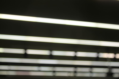
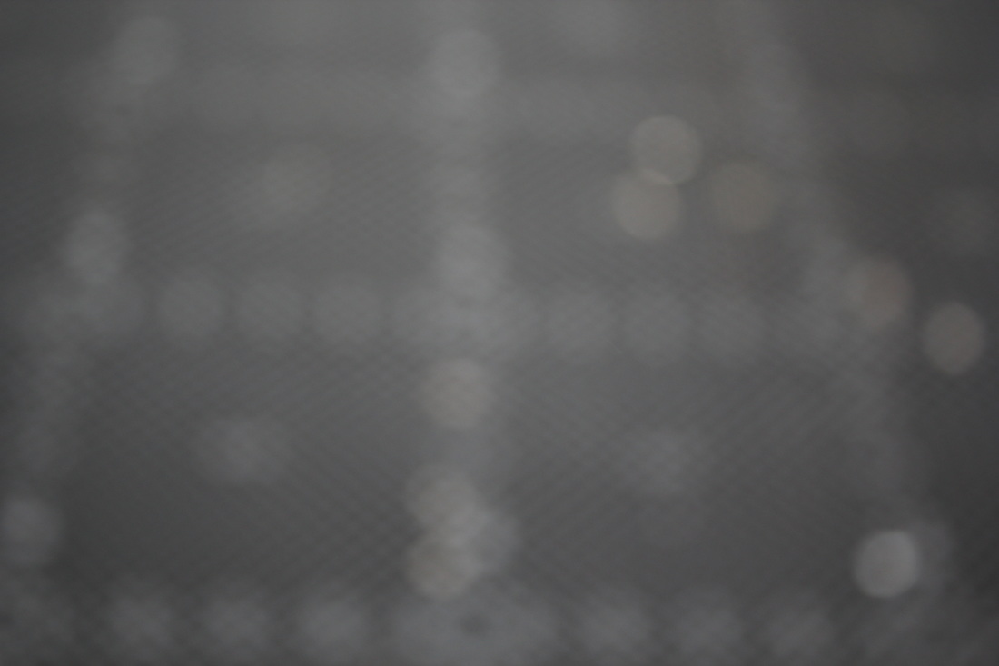
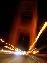
This photo is abstract because the blurred lights, the lines it goes it which makes a pattern and also some of the lights look like ---- a dash, that sort of pattern which makes it abstract.
|
|

3 things to do!3 things to do next lesson to get my photograms better:
1- more objects with interesting shapes e.g: not something like scissors, glasses... 2- splash or brush the developer on top of the paper instead of putting it all in. 3- make more lots more photograms instead of 2 or 3. |
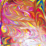
The formal elements for texture is illusions. I think it looks like a simple illusion because of the patterns as they go in different directions. Also the way its been designed, it looks like the shape of a feather. The brightness of this photo is at the bottom, it looks like something is shining on to it. The colours mix together really well which makes the whole photo/painting stand out well
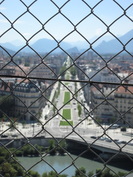
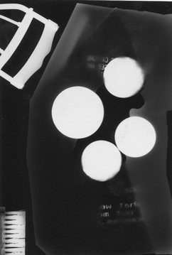
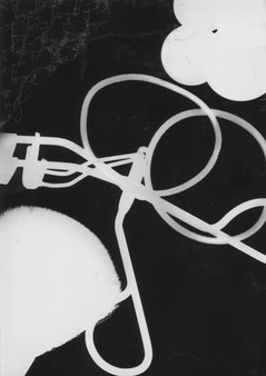
This is my photo that I took in France, you can see the light that shines through the fence which leaves a pattern in the shadow. Also the light shows the inside of the cave which looks interesting because the whole edge is really dark. This is a photogram I made. We went to the dark room and used this shiny paper, the shiny paper is not allowed to see the light or it won't work in the developer. To see what your doing, you can turn on a red light that wont effect the shiny paper. Once you put your objects on the paper in the order you want you turn the light on for 8 seconds. Lastly you put your paper in the four liquids, first the developer to get the image, second the stop, which stops it from developing even more, then you put it in the fixer which just fixes it up and makes it clear and the last liquid is water where it cleans of all the chemicals on the paper and you leave it in there for about 5-10 minutes and you leave the paper in the other chemicals for -2 minutes. I really like this photogram because in the top right corner i think it looks like smoke fading away, the things in the two corners are difficult to identify what it is but it leaves a nice shape and the thing in the middle looks like it could be one big wire connected together. This is another photogram I made, this one is different to the other one because I think the objects are more obvious to identify. In the middle I put a receipt with a rip in the middle but it didn't really come out well but it came out with the writing which made it look cool. WWW: The photograms turned out well and I really like them, also I think there both quite abstract. EBI: I should of left it in the developer longer and put more objects on it to look more abstract. abstraction mind map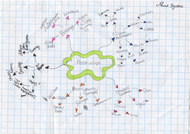
|
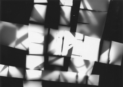
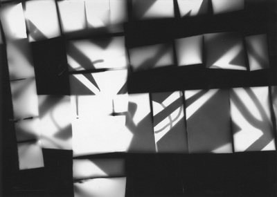
More photograms I have made in class.
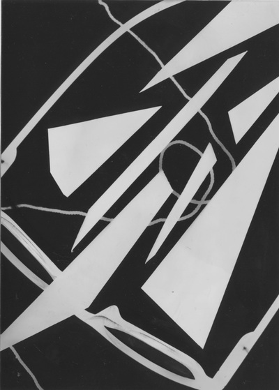
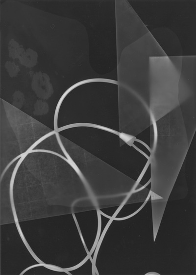
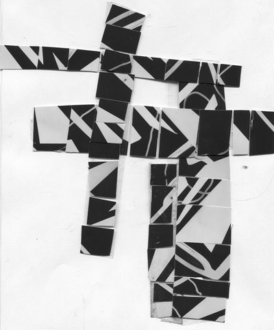
I am really happy with my photograms that I have recently made because they look abstract. I think I have really improved making photograms since the first one I made. In the photogram on the left, I made it different and abstract by cutting out different shapes out of paper and placing them on my photogram. The second photogram turned out really good because of the grid paper which made you see the grid pattern on the triangles I cut out.
duotonefinal piece
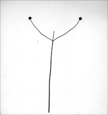
Jaromir FunkeJaromir Funke's takes pictures of shadows. But he finds interesting objects and places them where it will make a shadow and have an interesting outline for the picture. For my homework task I am going to take 20 pictures like Jaromir Funkes photos.
Jaromir's photos
|
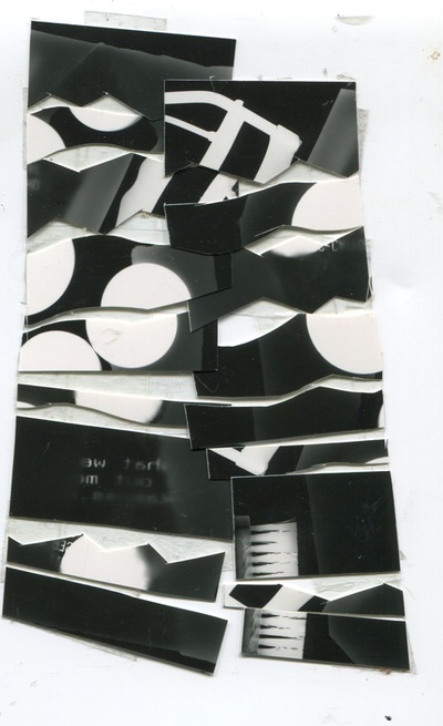
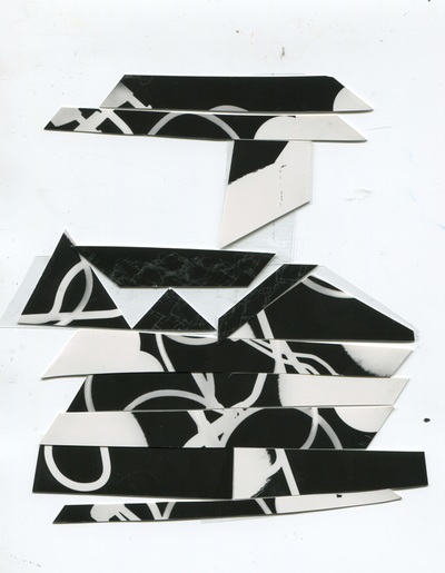
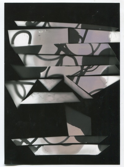
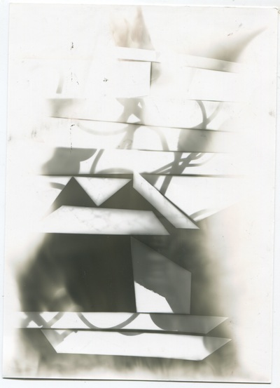
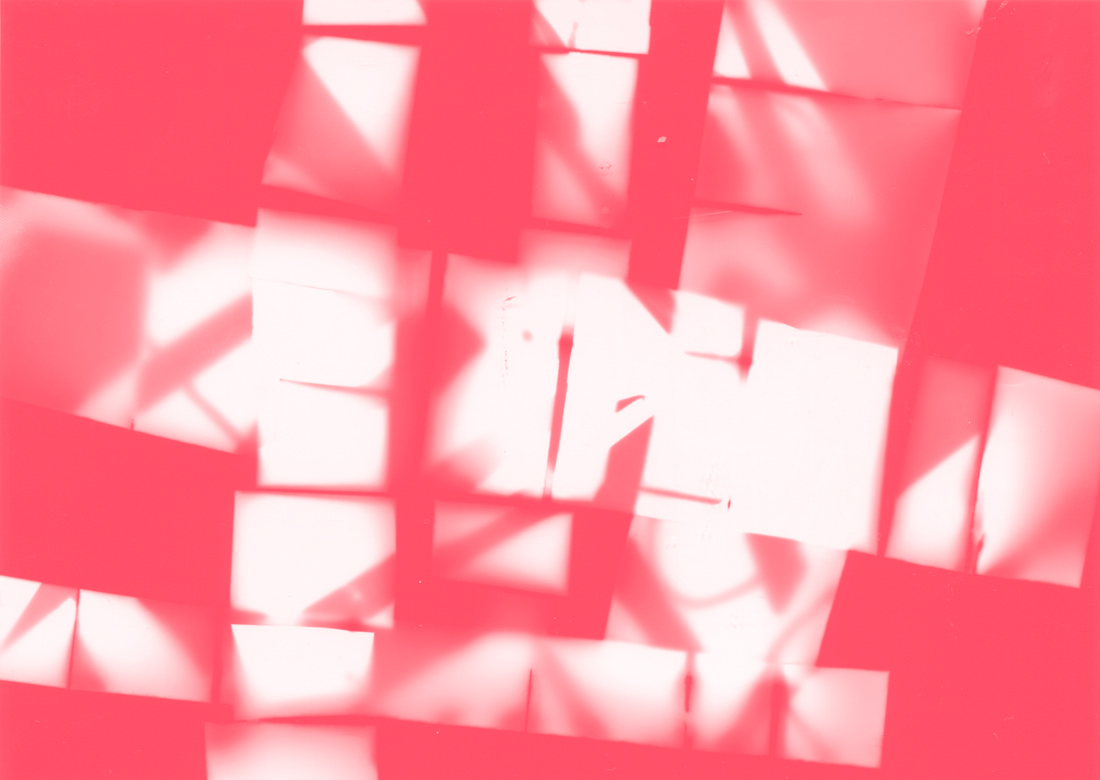
To make this I cut up my original photogram and stuck them together using masking tape, after that I placed the cut up photogram onto photographic paper to make another photogram. To make a negative image of this, I took the photogram from the second picture to make another photogram and it came out as a negative. To make the last image I just did the same thing but flipped it round.
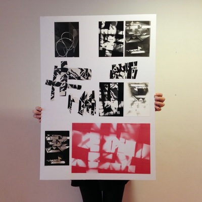
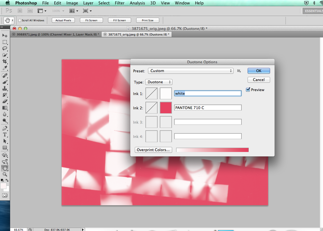
This photogram I made for this one turned out completely different to what it should have but I did the same thing on this photogram by cutting the original. I think this is the best one because in the third picture it came out a pinky peach colour which made it really pretty and nice. This is a duotone that you have to make by using photoshop. To make this you have to use your cutup photogram then whilst your on photoshop you click edit - mode - duotone. first you select the background colour then you select your main colour. That is how I made this. My final piece is all the photograms and the duotone I have made all mounted on this big piece of cardboard that I am holding up.
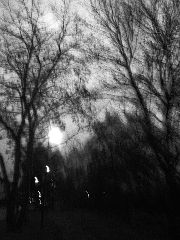
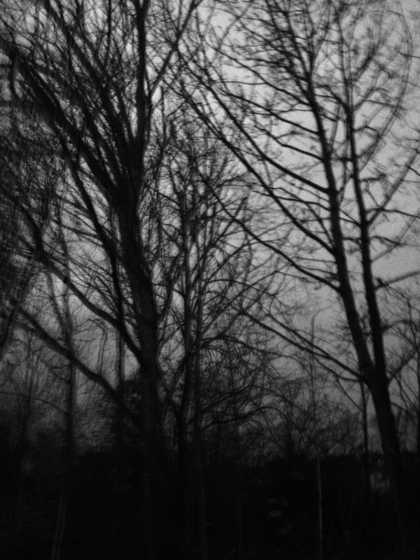
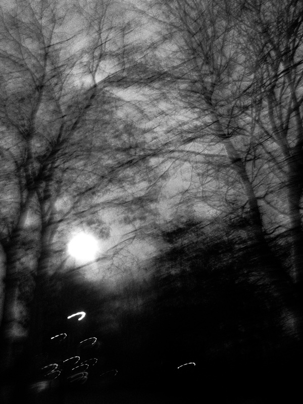
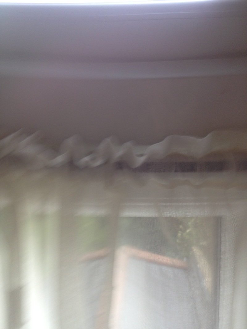
These are pictures I took in school. They are meant to be blurry or out of focus.
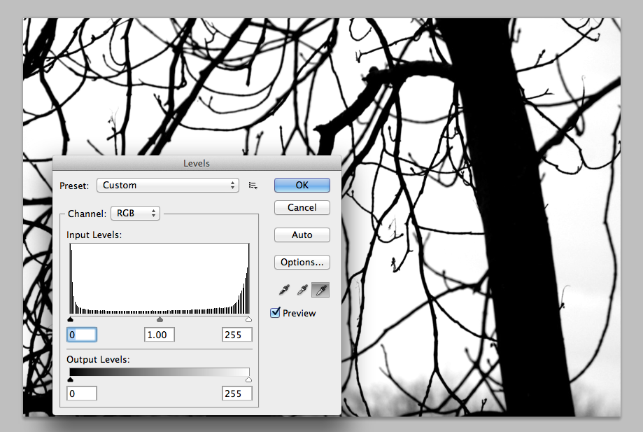
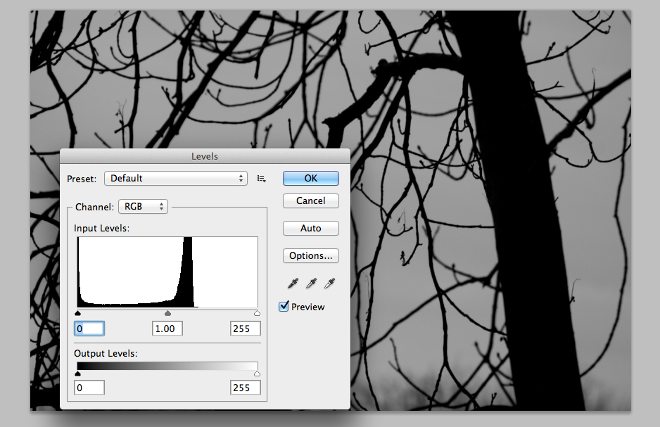
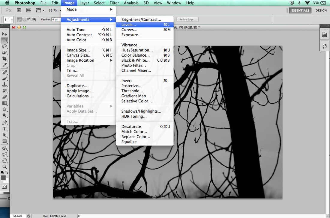
Harry Callahan
Callahan discovered photography at the age of 26. He launched experiments that would continue and found ways of working and choosing photographic subjects. He never went to college or studied more photography. Instead in 1938, he was working at the Chrysler Company in Detroit, and joined Chrysler photo club and learnt photography skills from a friend I really like his work because they can be minimal and monochrome. |


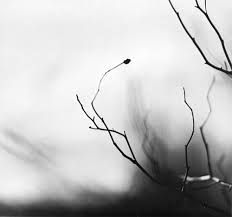
Ralph Eugene Meatyard
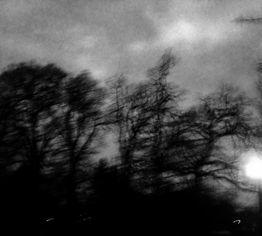
Meatyard was born in Illinois but lived in Lexington Kentucky, he worked as an optician. He used to experiment in multiple exposures, motion blur, masks and other photographic abstraction. In the images I picked they are a mixes between his “Motion blur” images and his “Zen twigs” images. I prefer his masks images where he gets people to wear a mask of an old mans face. The masks images are not very abstract so therefore I wrote about his “Zen Twigs” and “Motion Blur”.
Meatyard was born in Illinois but lived in Lexington Kentucky, he worked as an optician. He used to experiment in multiple exposures, motion blur, masks and other photographic abstraction. In the images I picked they are a mixes between his “Motion blur” images and his “Zen twigs” images. I prefer his masks images where he gets people to wear a mask of an old mans face. The masks images are not very abstract so therefore I wrote about his “Zen Twigs” and “Motion Blur”.
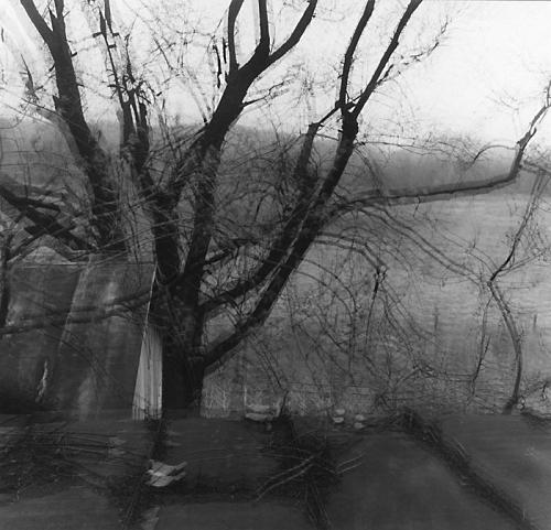
These two photos I have taken are inspired by Ralph Meatyard, I could of have improved this by shaking the camera abit to make the photo more like Ralph Meatyards.
After I took these photos I edited them on photoshop to make it more white. here is how I did this:
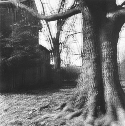
Here are a few more Meatyard pictures I have taken outside from school.
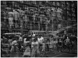
Jaromir Funke inspired photos I have taken that I made black and white.

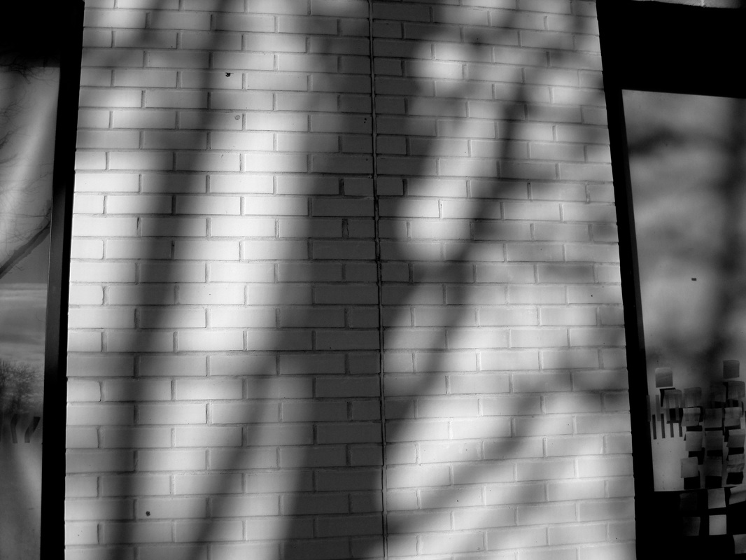
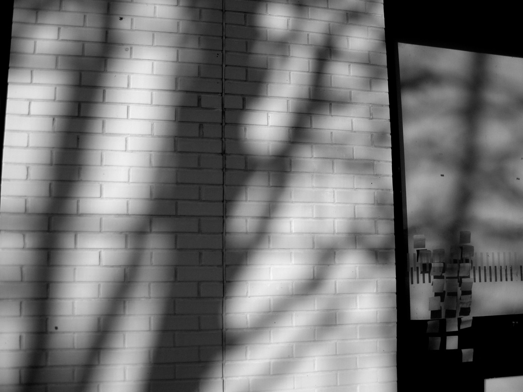
I took these photos because it had a range of shadows and Jaromir Funke's photos also have a range of shadows. I got my friend to form any shape in her body, I did this so the shadows would look abstract. These photos I have taken are not very abstract, also I tried to throw objects into the air to get more shadows but you could see the objects instead of the shadows therefore I didn't take the picture with the objects.
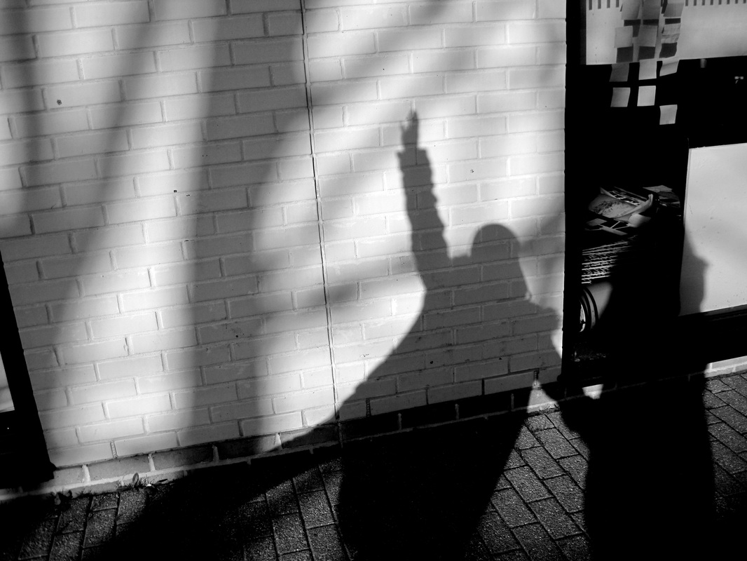
how to take a photo like jaromir funke
- You can use any type of camera to take pictures like Jaromir Funke.
- Find a place where the light hits the wall.
- Find any shapes and objects, place them where they will form a shadow and make sure the outline of the shadow is abstract.
- Try to find ways to make light shine through an object to make a pattern which will make the shadow more abstract.
- Space out the shapes so they have small gaps in-between them.
- Take the picture, making sure the camera is not being effected with the shadow
- Once you have taken the picture, edit it like the pictures above I have taken has been edited, so the white turns to a grey and the shadows get darker.
Jaromir Funke essay
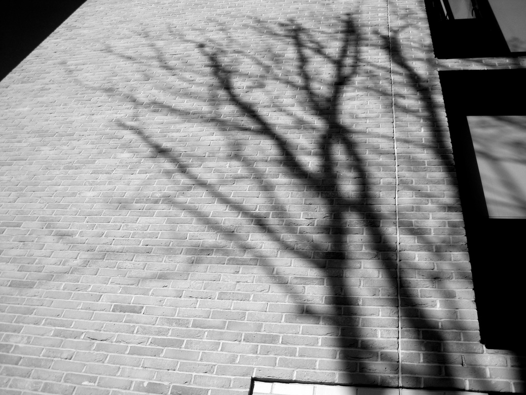
In this photograph I see lots of shadows cast by a variety of objects. I would use the words "abstract", "dark" and "shapes" to describe the photo. To describe the photo to someone who can't see it, I would say there are lots of shapes for example triangles, circles, squares and other irregular shapes. This is an abstract image because you can't tell what the shadows are and what objects created these shadows. Also there is a lot of patterns in it like grids and lines. In this photo I can see a face, the eyes are two triangles and also the nose is a triangle. There is a big shape that looks like a massive key but its realistic image looks like the handle of a spade.
I don't think the photographer used a lot of equipments to make this photo. Just the camera and the objects to make the shadow, but he may of not made the shadow and instead just found it and captured it. Also its about the lighting and where the light hits the wall to get the shadow effect. There are lots of patterns in this photo like the grid which fits perfectly on the square. There is a big range of tone in the photo and texture, for example there are a lot of grey, some are light some are dark. The shapes in this photo all create an image like lots of triangles in one place creates a sort of face.
I think the photographer captured the light so it creates the shadow and puts the patterns in the right place like the square in the middle, the streams of light makes the grid shape on the square. The picture is different from real life because its all shadows and the tones and textures make it look like an abstract image. The shapes and patterns interest me in this photo because if you be imaginative you can form other abstract images. Also the different types of tones and textures makes this photo look darker, deeper and it makes you really think about how this picture was created.
Although this photo looks as if it is three dimensional its just a projection on a flat wall and I think it presents the space in this photo. What strikes me as most interesting in this photo is the shadow of the face, its interesting because lots of small shapes can form something interesting.
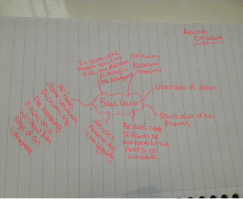
Saul Leiter
5 characteristics defining Saul Leiter:
unusual -I don't see many photos like this.
abstract - Only in some of these pictures are hared to explain what is going on.
colourful - A lot of colour is in all of the photos.
lighting - In the pictures where a lot of lighting is used , the photographer only focuses on the light.
vintage - In the photos some of the people look like there wearing these old dresses suggesting the atmosphere is very vintage.
Quote
One of Saul Leiters quotes was " Photography allows you to learn, to look and see. You begin to see things you would never pay attention to" I strongly agree with this quote because before knowing about Saul Leiters work, I always took pictures of basic things that people would notice everyday. After attempting to photograph like Saul Leiter I now always focus on the unusual things that no one takes notice of which I think makes photography much more fasinating.
About Him
Saul Leiter was an American photographer and painter whose early work in the 1940s and 1950s was an important contribution to what came to be recognized as the New York School of photography. He died on November 26, 2013.
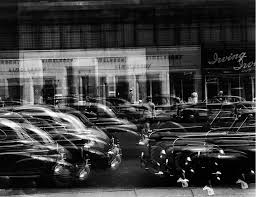
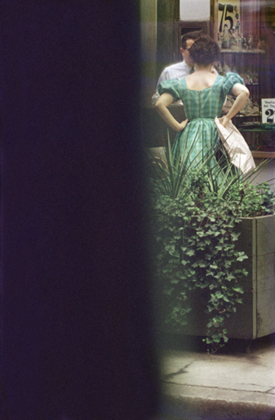
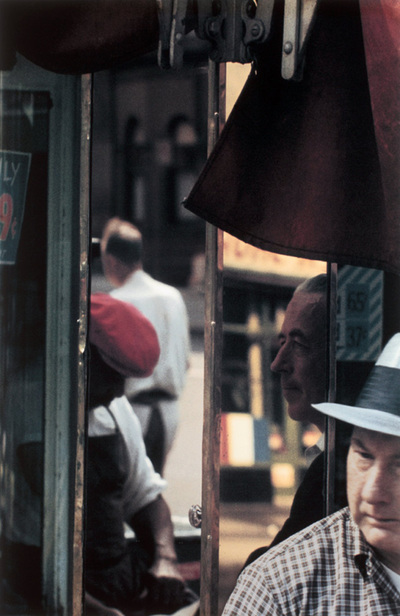
Saul Leiter photos
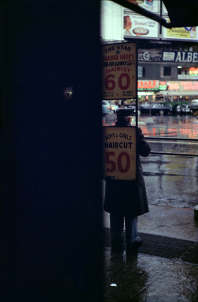
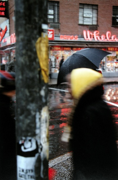
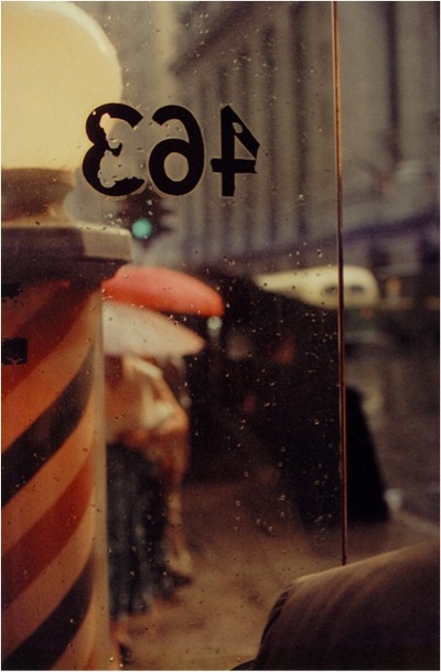


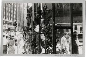
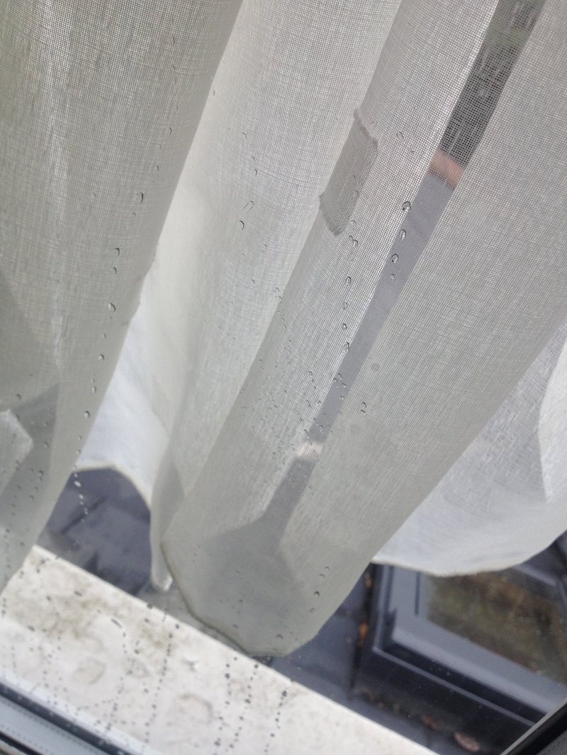
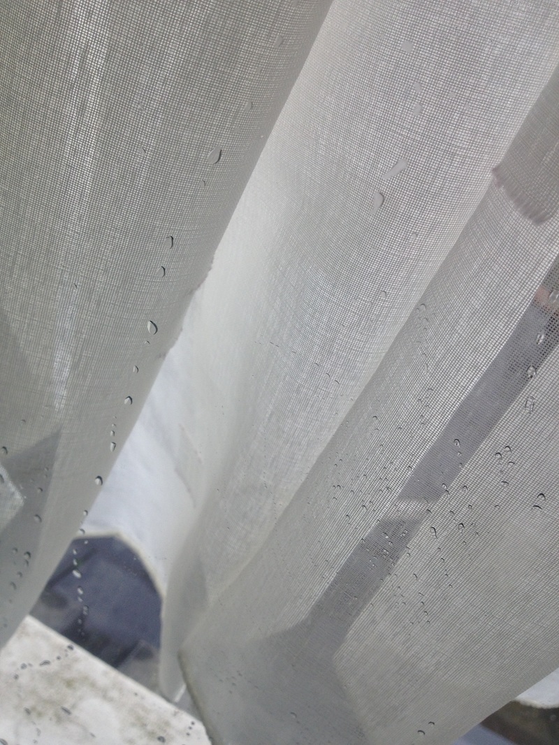
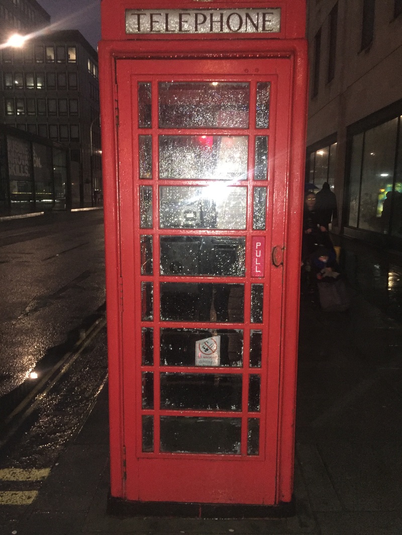
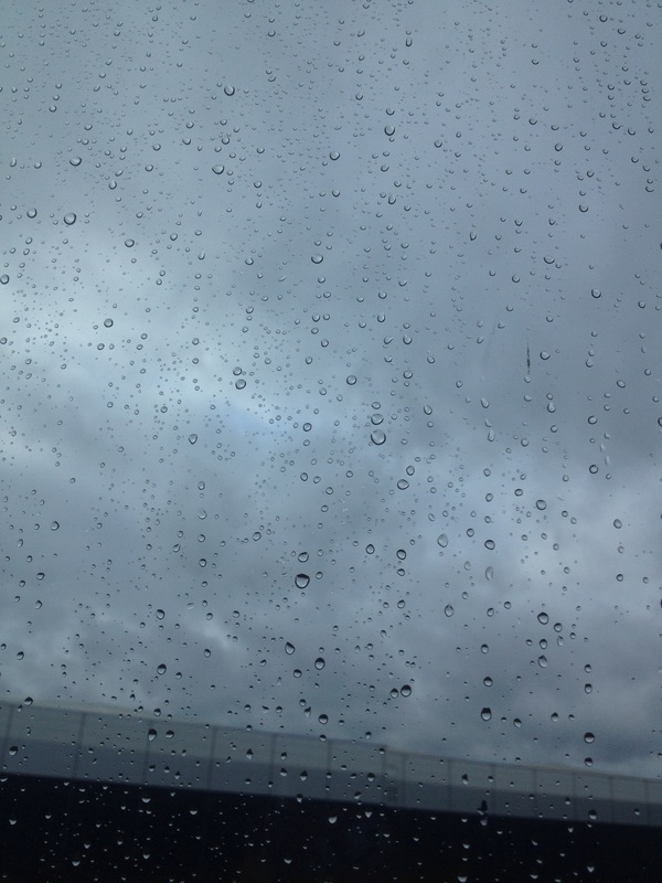
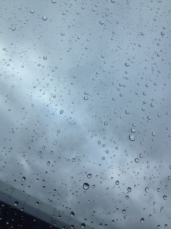
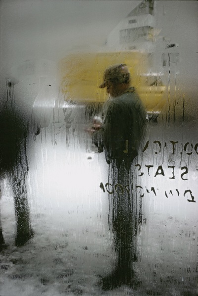
I chose this image because it appealed to me the most. It did this because it looks like a cover of a horror film by the dark edges, the water drops and the the dark bold spaced out letters which looks like one letter "A" is half missing.
This photograph is quite unusual and it surprised me because to get a photograph like this you would have to go out in the dark and find one street lamp where the light hits the letters really well, normally something like that would have been edited on a computer.
I think lighting is a really important formal element in this photograph because where the light hits on this photo, you are able to see the streaks of water and because of the second light (the smallest one) you are able to see the letters really clearly and the objects that are behind this window.
Whats important in this photograph is the texture and tone, in the bottom of letter "T" it looks as if some of its been rubbed of suggesting its made by paint and the water has destroyed it or it has been there for a long time and its getting old and un neat. Also the picture is mostly made up of blacks and whites which is different from the way Saul Leiter normally takes his photos as a lot of them have colour.
I don't think you can tell what the photograph, there is no evidence of how he took it or even where he took it. All I can see from this photograph is the it has been taken after it has jest been raining or while it has been raining and that it had must of been late as it is dark, I think that is what makes this photo abstract.
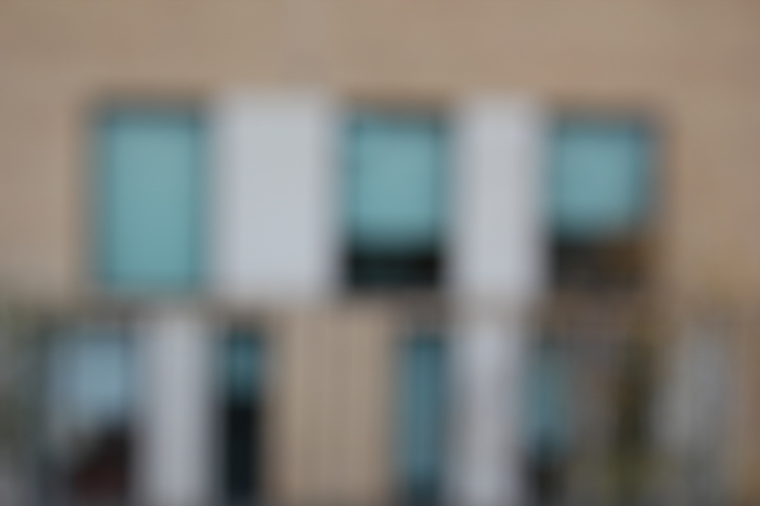
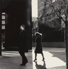
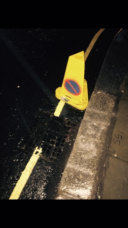
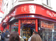
Pictures taken outside of school like Saul Leiter
MIND MAP about Saul leiter's pictures
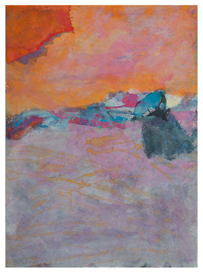
This is my favourite painting from Saul Leiter because of the colours he used, they are all light and because I think he used water colours which makes them blend really well. I think it looks like a mountain , the blue represents the sky, the peachy colours look like the sunset and the pink are the mountains. This photo is abstract but not as abstract as I thought of things this painting could be.
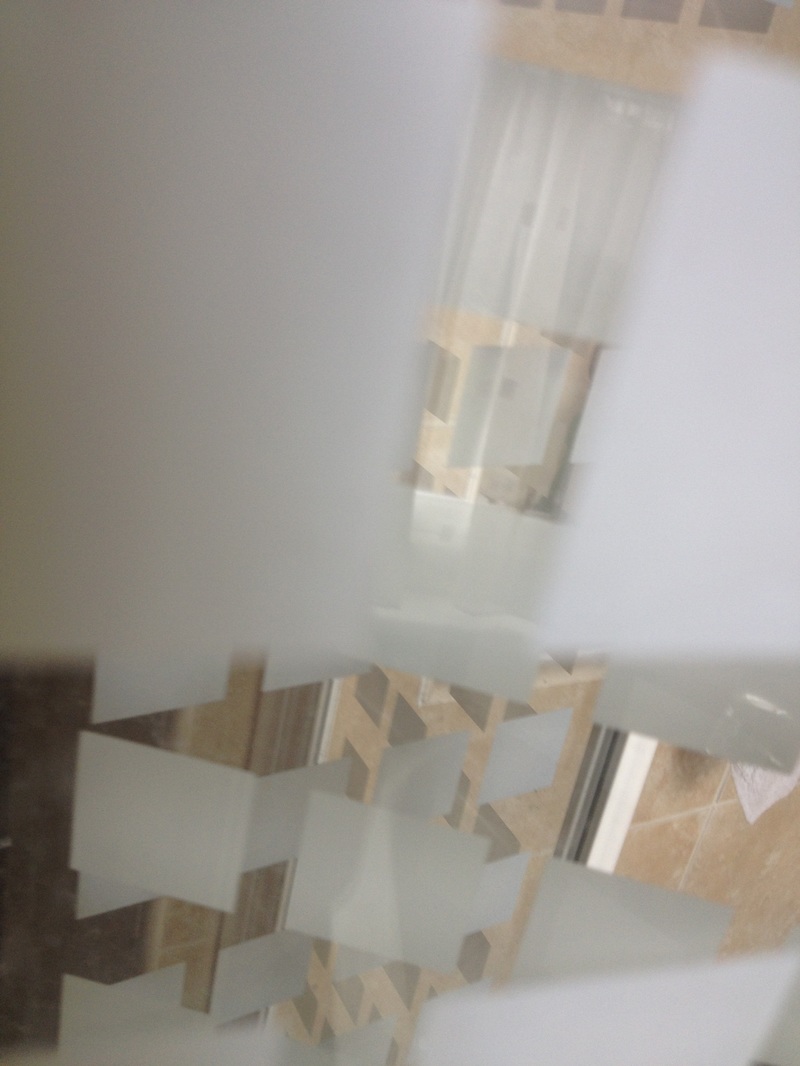
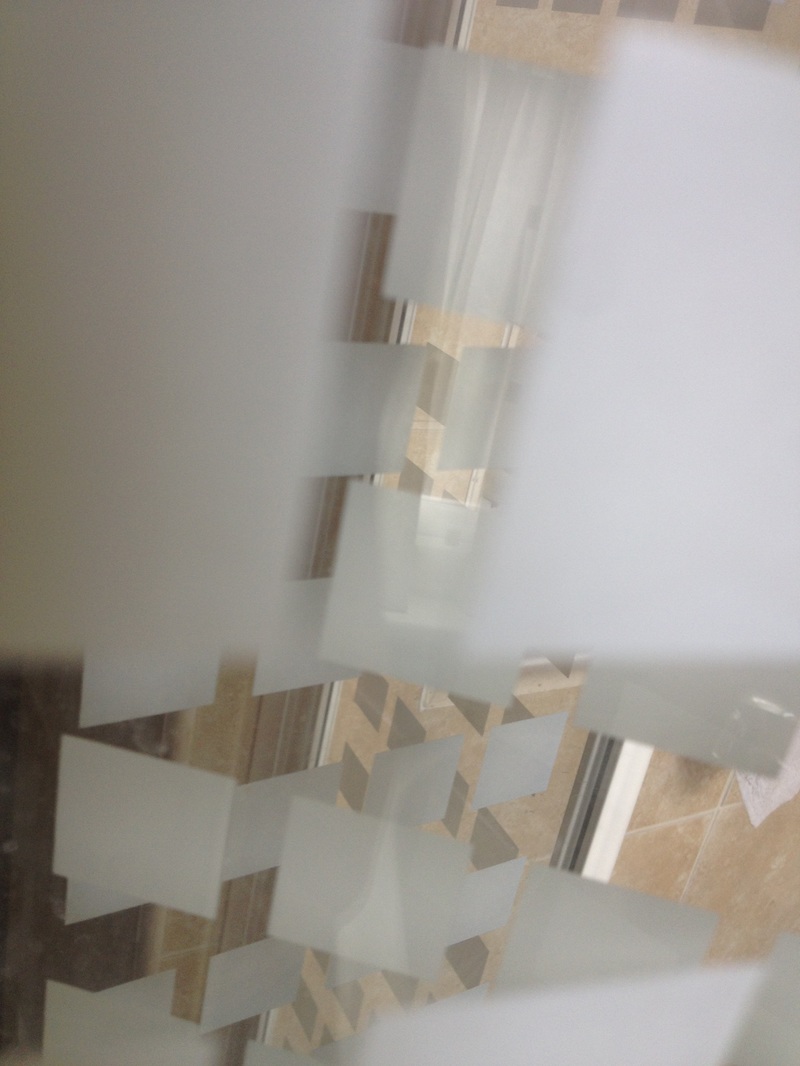
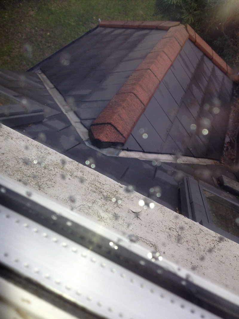
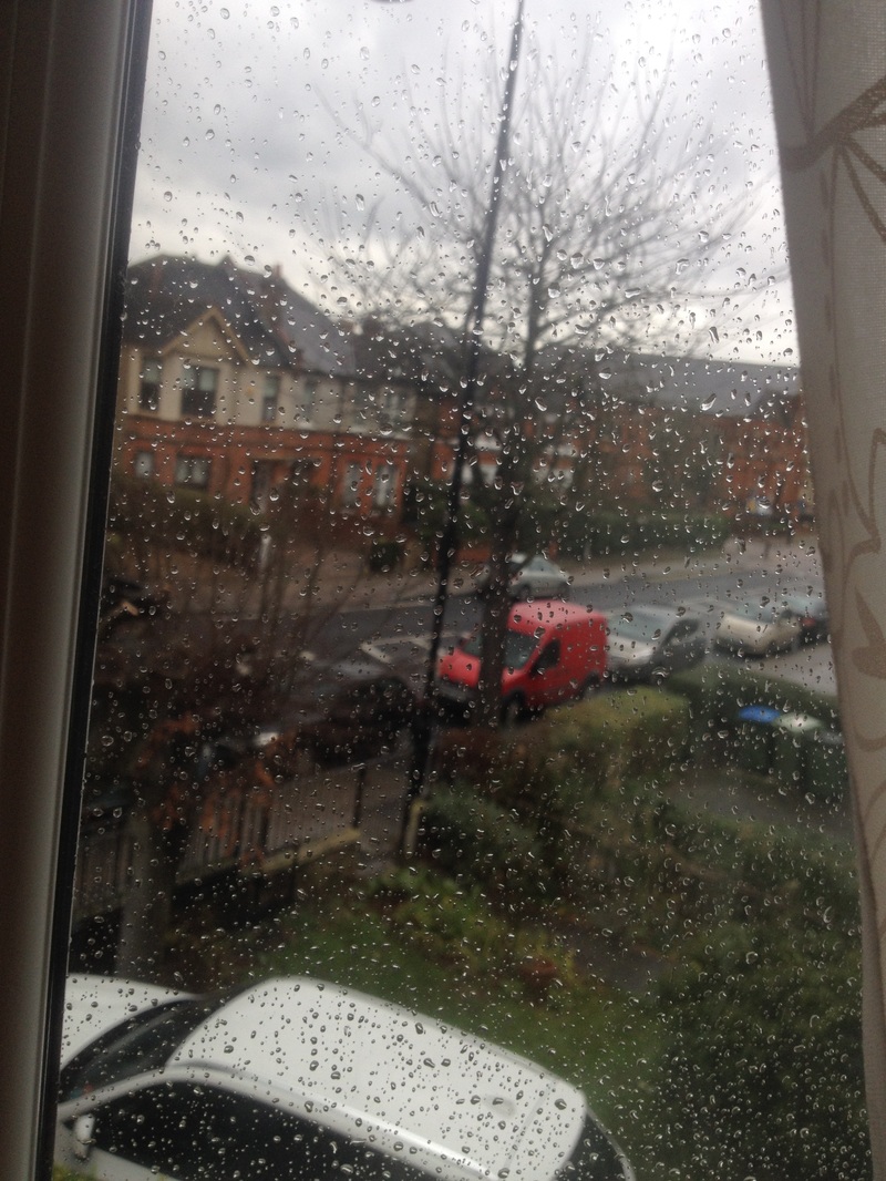
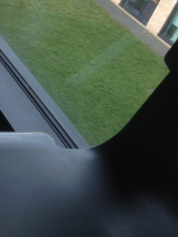
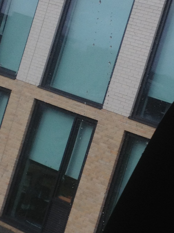
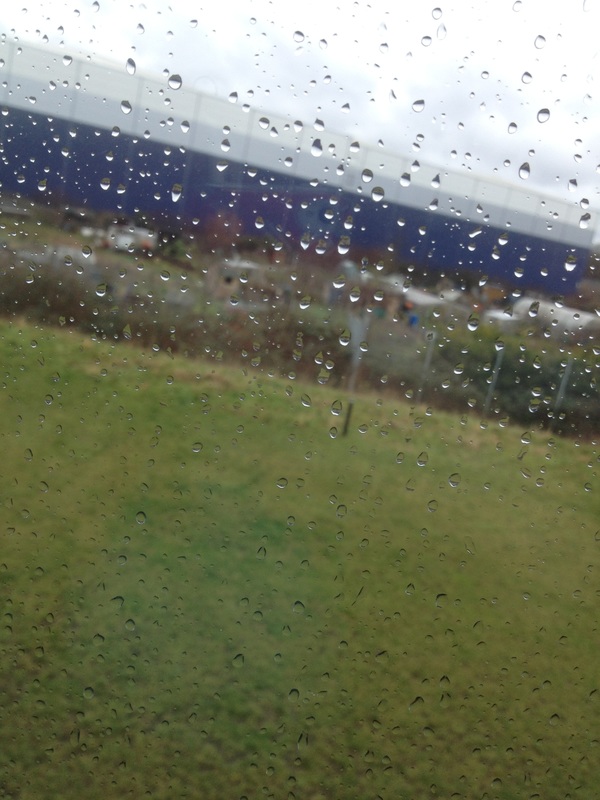
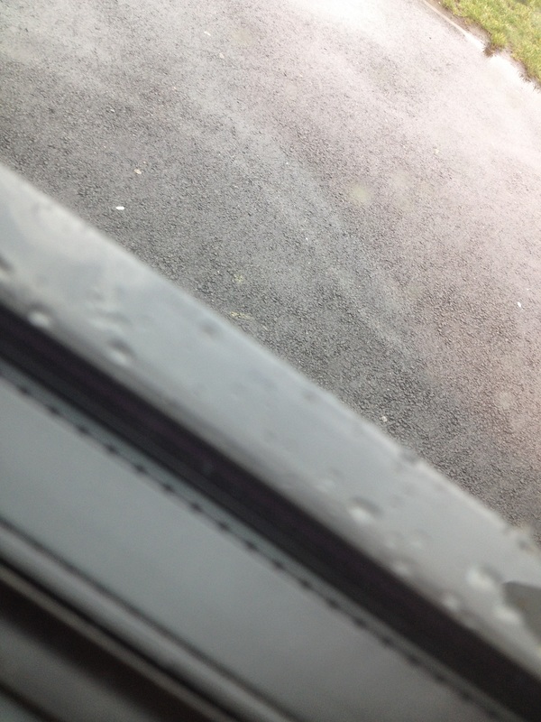
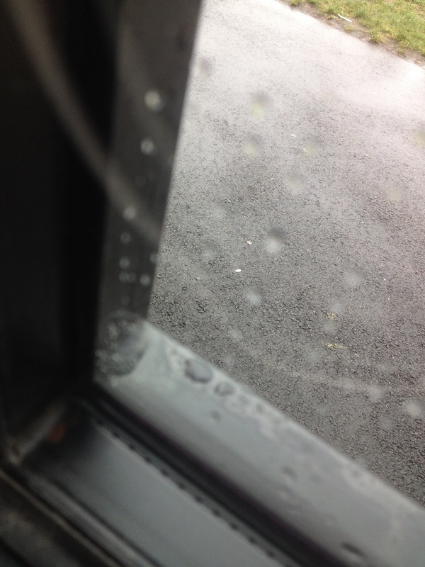
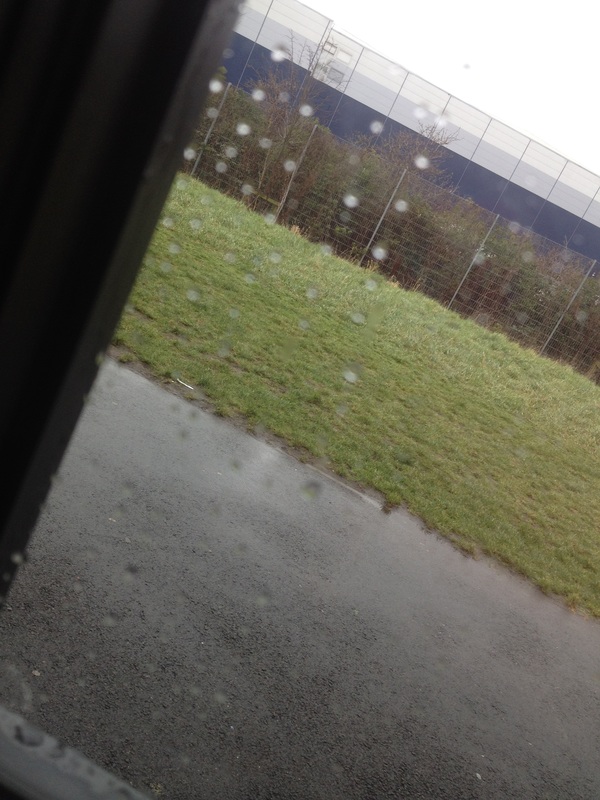
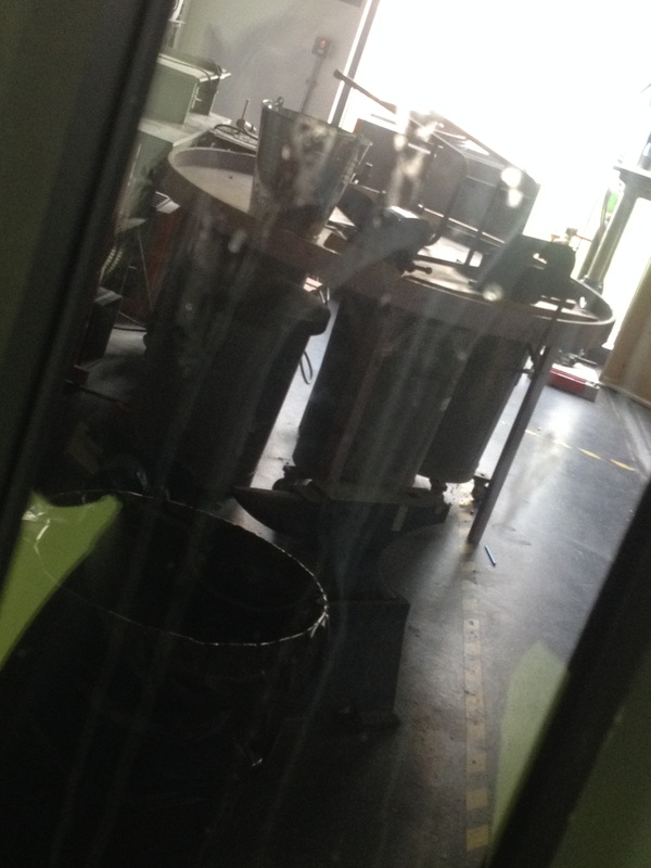
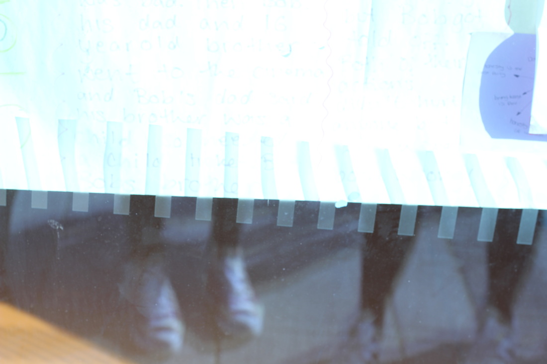
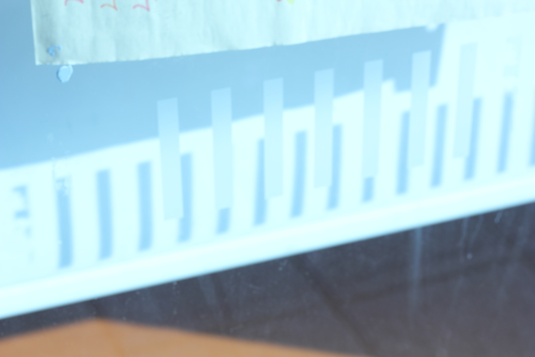
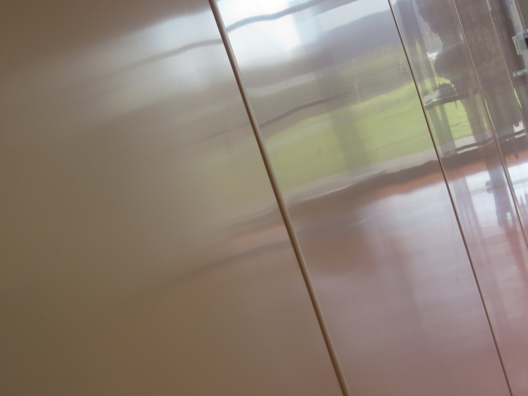
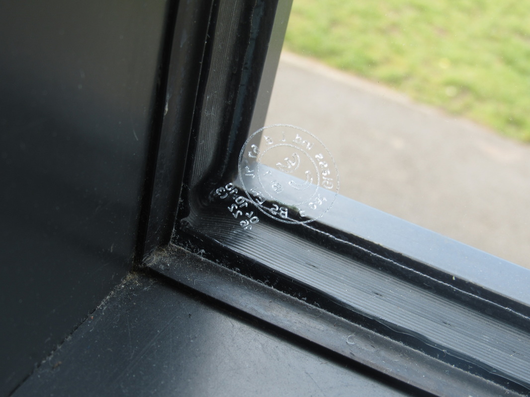
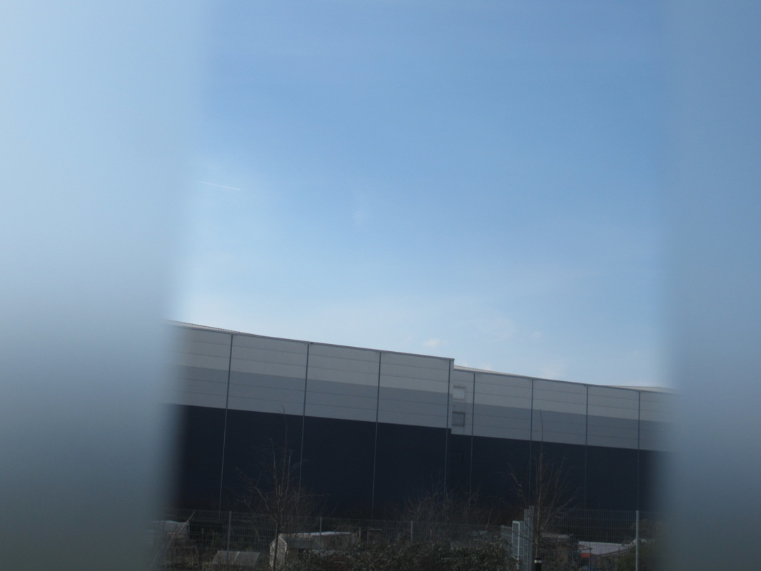
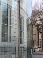
These are photos I took outside of school and in school of Saul Leiter. This time instead of taking pictures of different things similar to his, I had to take pictures through glass. I took most pictures from a window but I also took photos through a pair of glasses.
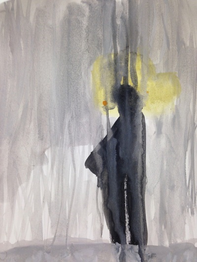
Saul Leiter also paints pictures based on his photographs. This is a painting that I did, looking like this photo by Saul Leiter. I painted the figure of there man without making it details as I'm trying to keep it abstract, also I aded drips of grey on top of the mans figure to represent the rain on the window in the picture. I am really happy with the out come because it gives you an idea of what I did in this painting to make it abstract.
|
These are also some of my paintings. The second painting started of as abstract then I made it more naturalistic, not on purpose but I started to loose focus. In the first painting I tried to make it look like one of Saul Leiters photos. I did this by painting the stripy pole. In the middle of the photo I painted parts other photos from him
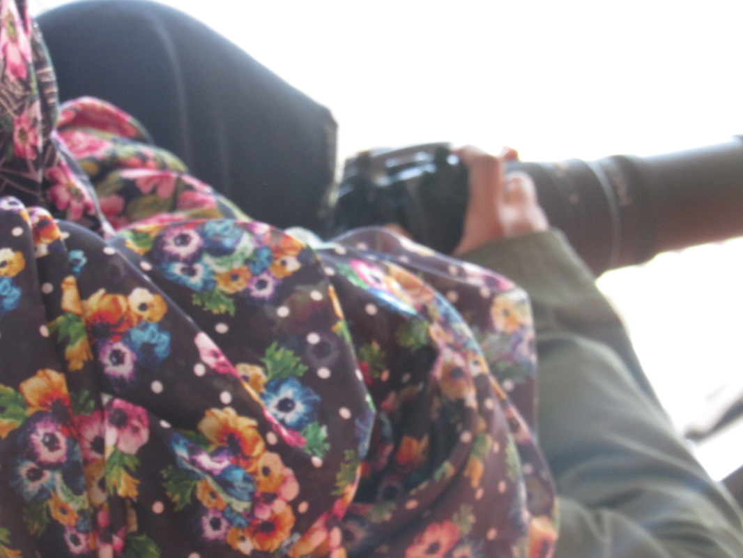
Here are more pictures I have taken like Saul Leiters photos. Also I have tried to take pictures that resemble his photos.
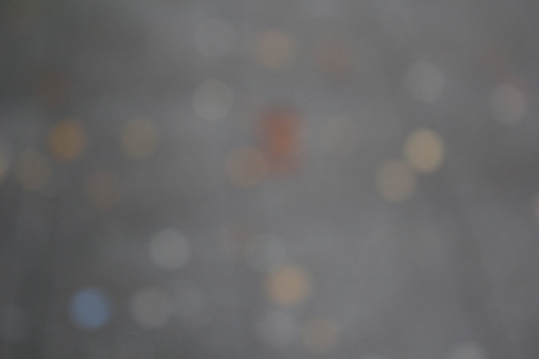
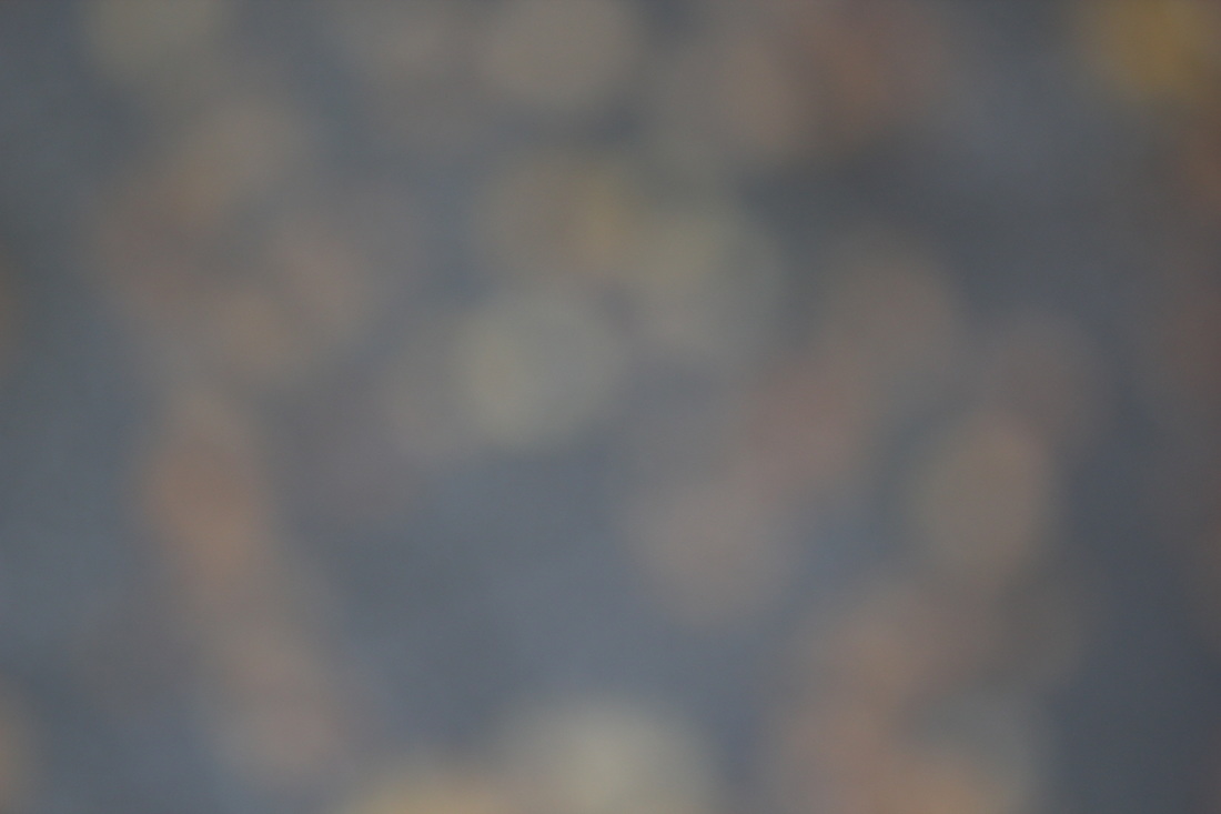
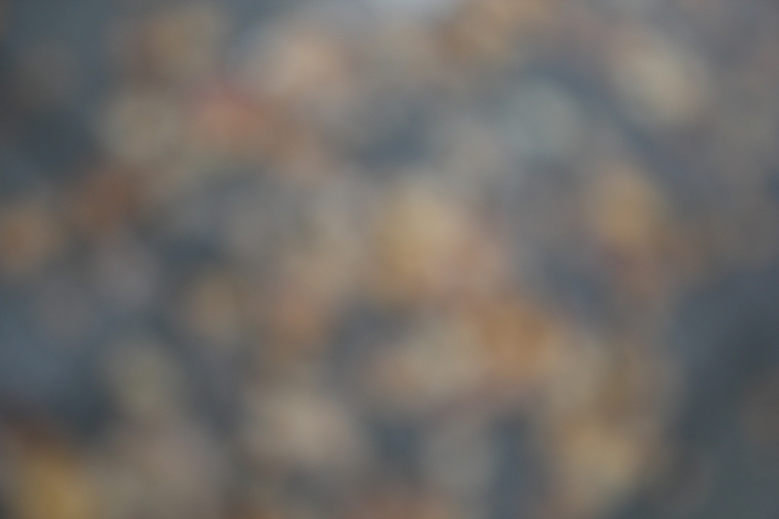
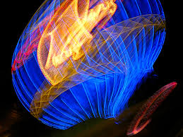
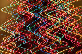
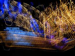
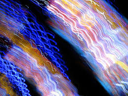
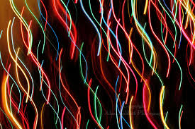
ALAN BABBITTSince the early 1970’s, Alan Babbitt has been creating fine art photography with an offbeat view of the world and a dry sense of humor. His photos are abstract by the glowing lights that are flashing around. Also there is a lot of colour that blends together so when you put all his work together its like one big colourful collage.
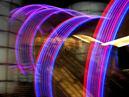
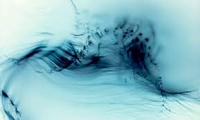
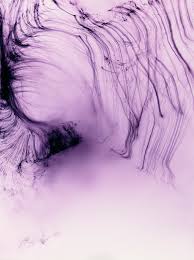
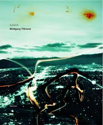
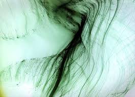
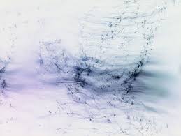
Wolfgang TillmansWolfgang Tillmans born 1968 is a German fine-art photographer. His diverse body of work is distinguished by observation of his surroundings and an ongoing investigation of the photographic medium’s foundations. He's way of taking pictures is really abstract because you have no clue how he took this photos and I think he's aim is to make you think about what they are. For example I think that in the first two photos could be ink falling in water.
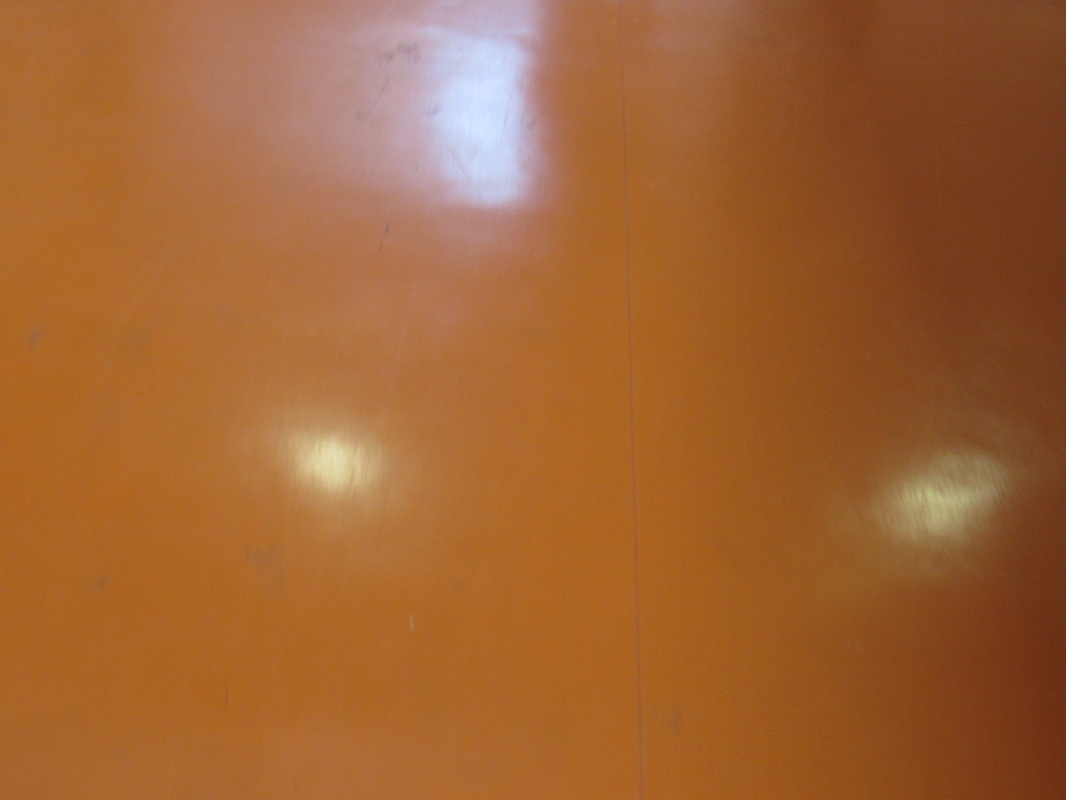
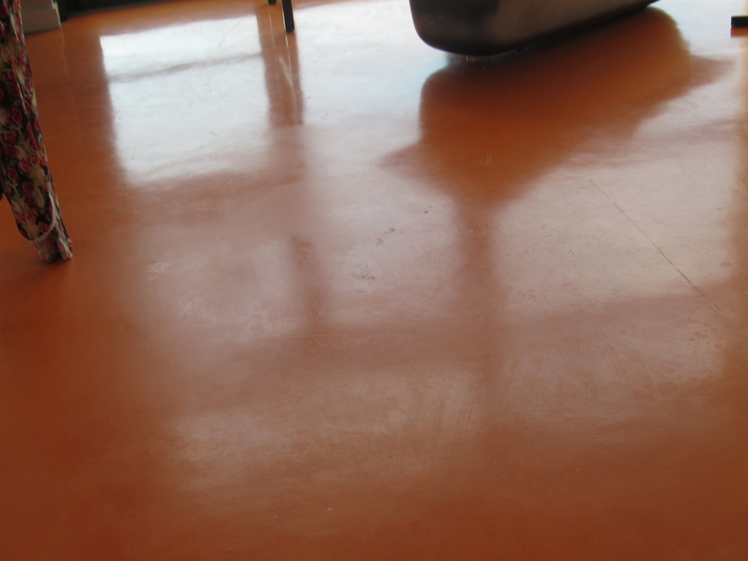
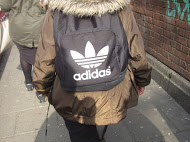
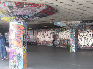
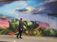
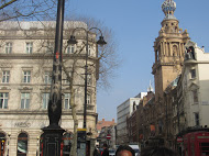
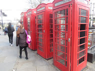
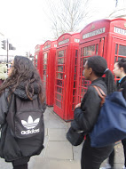
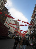
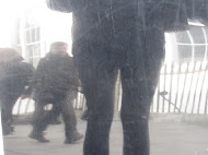
My whole class went on a photography trip to 'the photographers gallery' where we looked at some of Saul Leiters work. We looked t his paintings and learned more about him. Also on the way and way back to and from the gallery I managed to take a few pictures that were like Saul Leiters and also just abstract photos. The trip as a whole was fun and made me understand more about Saul Leiter.
Final Outcomes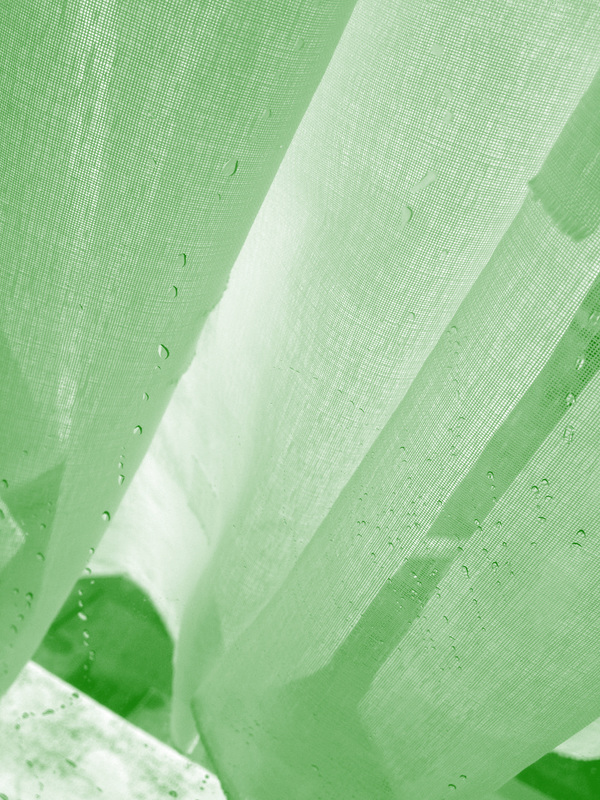 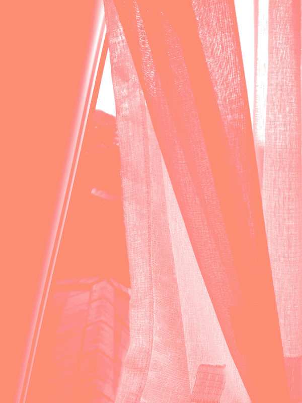 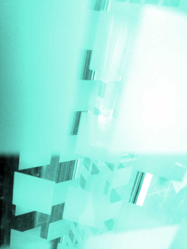 Step by Step |
|
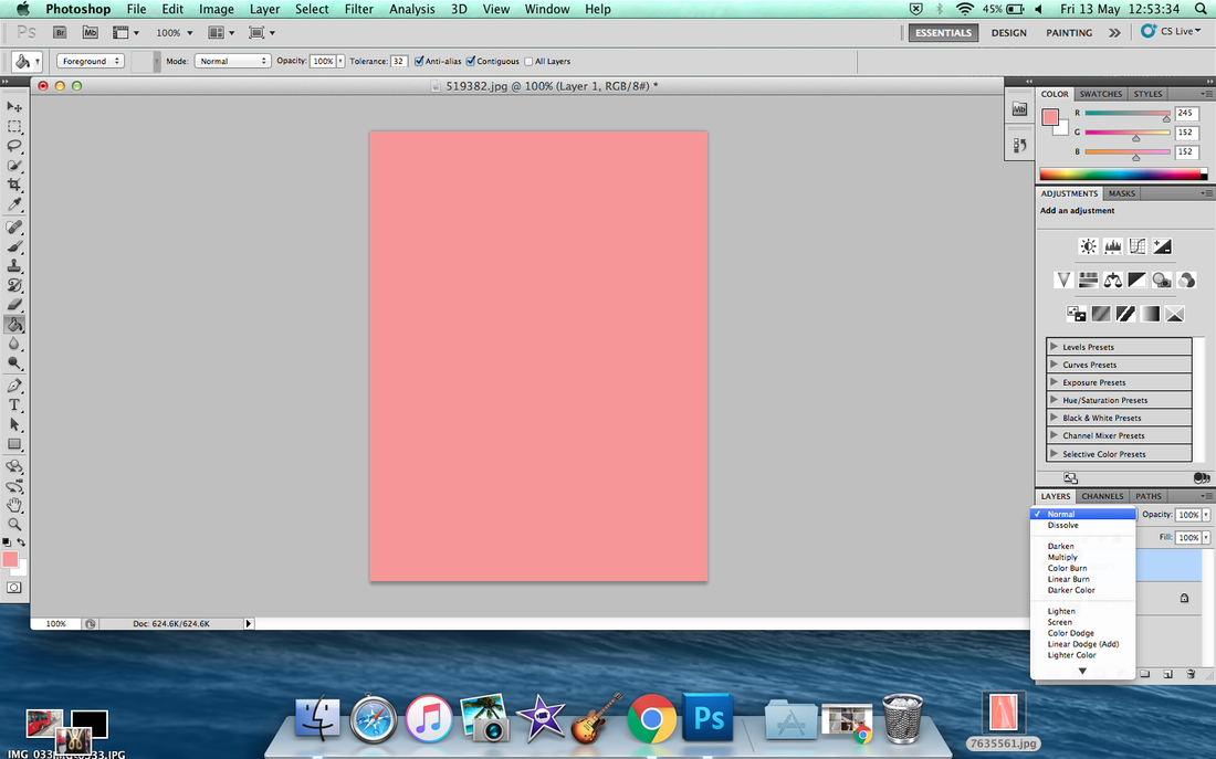
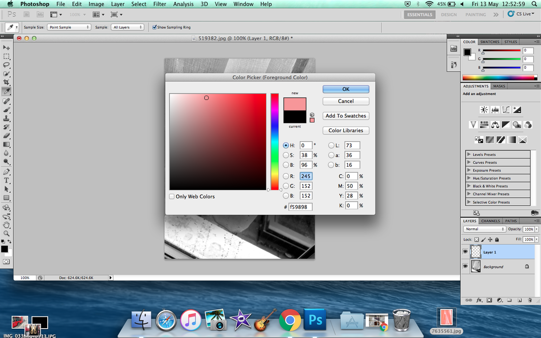
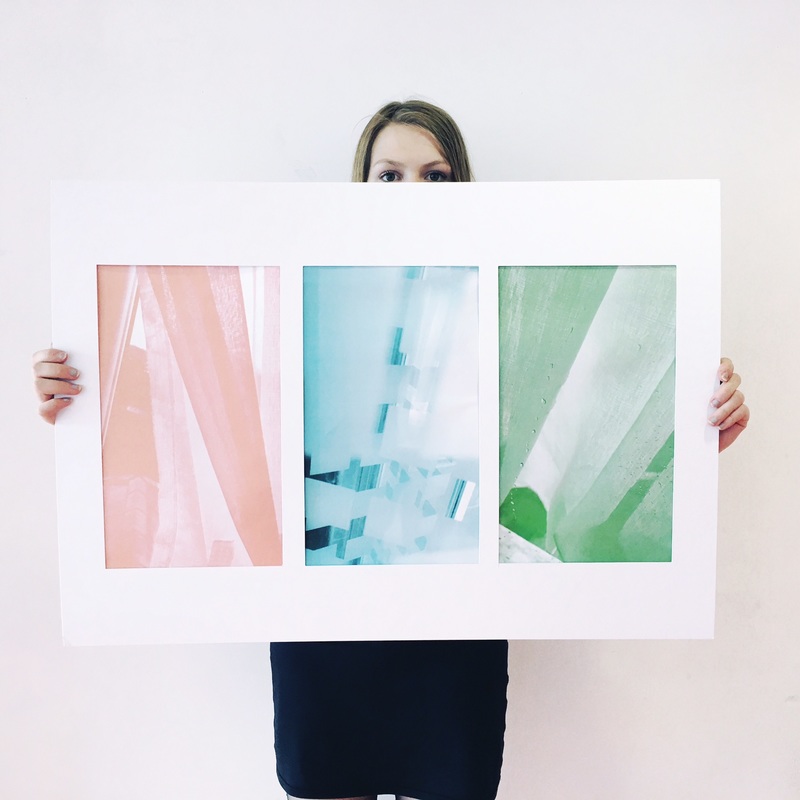
my final piece
evaluation
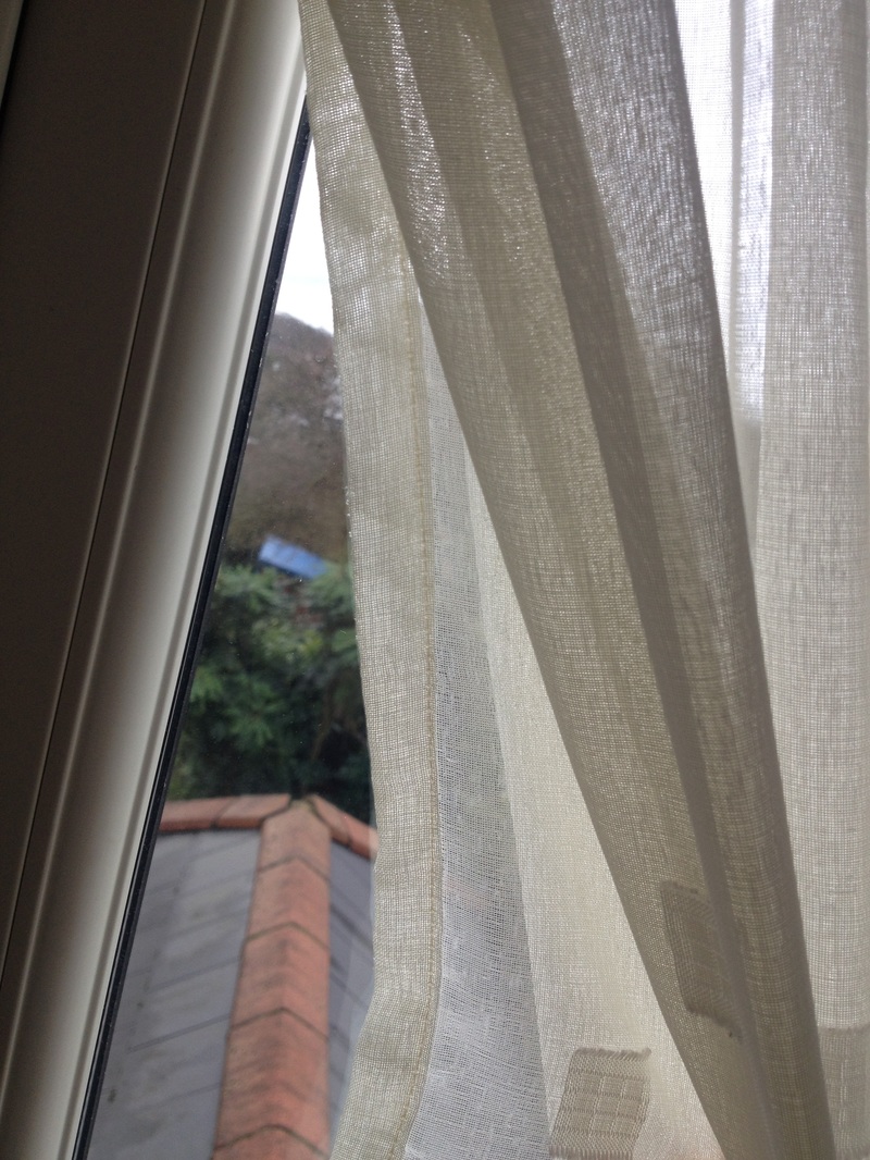
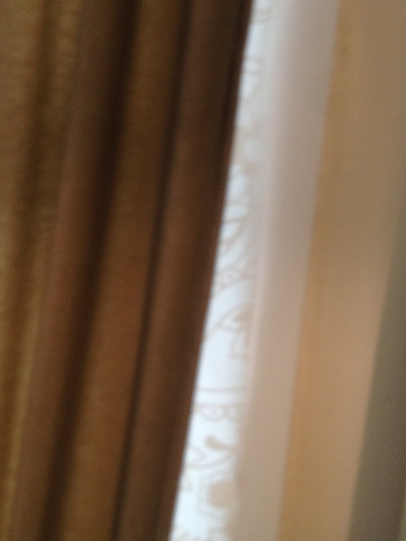
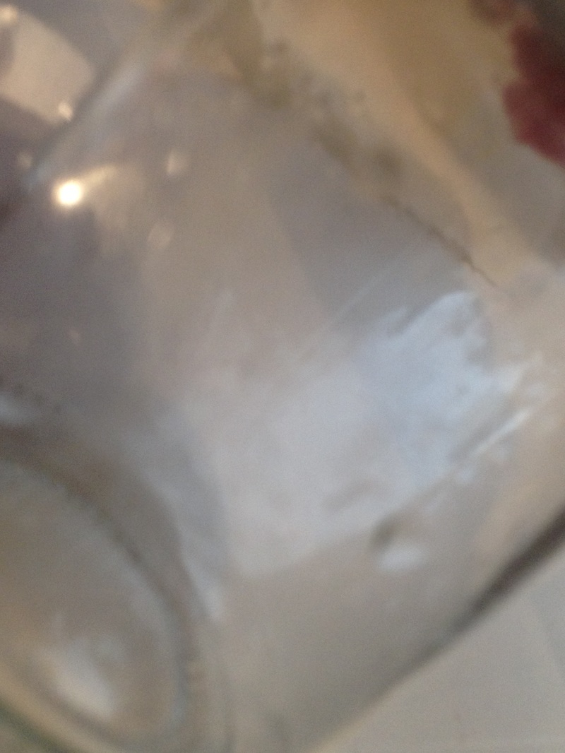
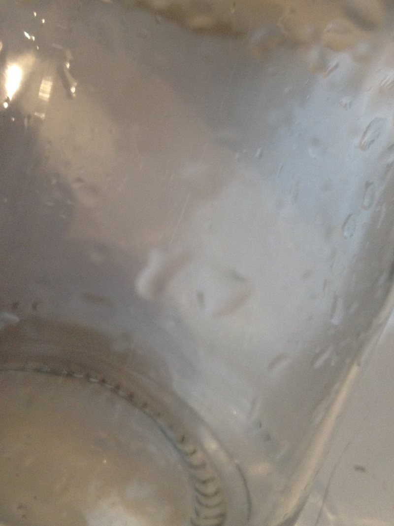
There has been many different things I have learnt about taking abstract photography including; not knowing what the picture is supposed to be, editing pictures into bright colors and taking pictures with different shapes and objects. In the begging of my abstraction page I started of taking pictures like the one where I focus the dance and blur the background. Further down on my page there is pictures that make people question, How did you take that? and I believe it shows how much I have progressed in this course, especially in photography as a whole. I really like my final outcome because its 3 bright fades colors, two of the photos are photos I took of a curtain that had a cool texture in the material and the other photo is of shower door kind of thing that had squares and when you fold it the squares overlap which I thought looked good.
